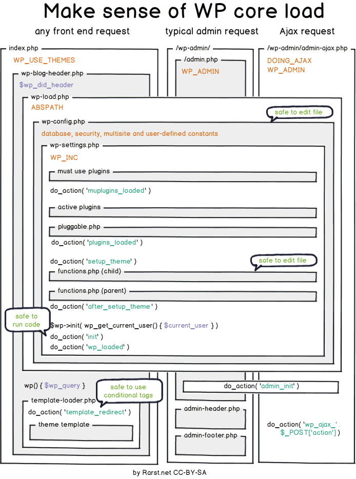
The path which is used for processing user requests.
Auto-generated thumbnails
When you upload an image to your WordPress website, the platform creates 4 additional image sizes alongside your original image.
Those automatically generated sizes are:
These sizes can be changed inside the media settings page (/wp-admin/options-media.php), and you can also add custom sizes:
// Must be included if your theme does not have it already.
add_theme_support( ‘post-thumbnails’ );

// Define new customs image sizes.
add_action( ‘after_setup_theme’, ‘proultima_add_image_sizes’ );
function proultima_add_image_sizes() {
  add_image_size( ‘portfolio’, 300, 9999 ); // 300px wide unlimited height
  add_image_size( ‘xl’, 1200, 9999 ); // 1200px wide unlimited height
}

// Add human-readable names to the newly added image sizes.
add_filter( ‘image_size_names_choose’, ‘proultima_add_image_size_names’ );
function proultima_add_image_size_names( $sizes ) {
  return array_merge( $sizes, array(
    ‘portfolio’ => __( ‘Portfolio’ ),
    ‘xl’ => __( ‘Extra Large’ ),
  ) );
}WordPress detects big images (big in their dimensions) which you uploaded and scales them down if their dimensions are larger than the threshold (e.g. 2560px threshold).
The default width threshold can be overridden with max_srcset_image_width() function.
The default dimensions threshold is filterable with big_image_size_threshold filter, and you can even disable it with:
// completely disable image size threshold
add_filter( ‘big_image_size_threshold’, ‘__return_false’ );Based on the breakpoints of your theme you can choose to customize the sizes attribute of the adaptive image tag. You can do that for the content images and for thumbnail sizes too:
function proultima_content_image_sizes_attr($sizes, $size) {
    $width = $size[0];
    //Page without sidebar
    if (get_page_template_slug() === ‘template-full_width.php’) {
        if ($width > 910) {
            return ‘(max-width: 768px) 92vw, (max-width: 992px) 690px, (max-width: 1200px) 910px, 1110px’;
        }
        if ($width < 910 && $width > 690) {
            return ‘(max-width: 768px) 92vw, (max-width: 992px) 690px, 910px’;
        }
        return ‘(max-width: ‘ . $width . ‘px) 92vw, ‘ . $width . ‘px’;
    }
    //Page with sidebar
    if ($width > 597) {
        return ‘(max-width: 768px) 92vw, (max-width: 992px) 450px, (max-width: 1200px) 597px, 730px’;
    }
    if ($width < 597 && $width > 450) {
        return ‘(max-width: 768px) 92vw, (max-width: 992px) 450px, 597px’;
    }
    return ‘(max-width: ‘ . $width . ‘px) 92vw, ‘ . $width . ‘px’;
}
add_filter(‘wp_calculate_image_sizes’, ‘proultima_content_image_sizes_attr’, 10 , 2);
function proultima_post_thumbnail_sizes_attr($attr, $attachment, $size) {
//Calculate Image Sizes by type and breakpoint
//Header Images
if ($size === ‘header-thumb’) {
$attr[‘sizes’] = ‘(max-width: 768px) 92vw, (max-width: 992px) 450px, (max-width: 1200px) 597px, 730px’;
//Blog Thumbnails
} else if ($size === ‘blog-thumb’) {
$attr[‘sizes’] = ‘(max-width: 992px) 200px, (max-width: 1200px) 127px, 160px’;
}
return $attr;
}
add_filter(‘wp_get_attachment_image_attributes’, ‘proultima_post_thumbnail_sizes_attr’, 10 , 3);# Ignore configuration and hidden files.
.htaccess
wp-config.php
*.DS_Store
*Thumbs.db
.ftpquota
# Ignore project files.
/nbproject/
# Ignore paths that contain user-generated content.
/wp-content/uploads/
/wp-content/upgrade/
/wp-content/themes/twenty*
/wp-content/cache
/sitemap.*
*.sql
# Ignore log files
error_log
.log/
# Ignore debug plugins and settings.
/wp-content/plugins/fakerpress
/wp-content/plugins/show-current-template/To force Drupal or WordPress sites to use secure https:// instead of http:// version of your site just add the following to the .htaccess file:
Note: replace “www.example” with the appropriate site domain. Also, this rewrite rule should be the first rule in your .htaccess file, since otherwise in some situations rewrites might not ever get to this rule.
# Force https access.
RewriteEngine On
RewriteCond %{SERVER_PORT} 80
RewriteRule ^(.*)$ https://www.example.com/$1 [R,L]For page to be downloaded and processed faster we need to:
Page rendering path: https://developers.google.com/web/fundamentals/performance/critical-rendering-path
WHY SO? If the files do not depend on one another, then you should place your blocking scripts above your blocking styles—there’s no point delaying the JavaScript execution with CSS upon which the JavaScript doesn’t actually depend.
Broadly speaking, this is why CSS is so key to performance:
async and defer attributes;HTTP/2 has made obsolete:
While open Google DevConsole click CTRL+SHIFT+P and search for:
Further optimize Bootstrap4 resources (remove CSS and JS which is not needed)
Use imagemin webp package to convert all images to webp format. https://web.dev/serve-images-webp/
for file in images/*; do cwebp "$file" -o "${file%.*}.webp"; done
Use critical tool to detect the critical assets which should be preloaded. https://github.com/addyosmani/critical/blob/master/README.md
Use https://gtmetrix.com/ plugin to test web page speed.
Create our plugin which would work as: https://perfmatters.io/features/